지난 시간에 이어서 이번에도 주어진 csv 파일 속 데이터를 필터링 및 매핑하여 원하는 그래프(Stack Bar Chart)로 시각화해 보자. 주어진 데이터는 나라별/날짜별 인구수, 코로나 19 백신 접종자 수(부분 및 전체 포함), 코로나 19 백신 완전 접종자 수를 Key로 가지고 있다. 해당 데이터로 각 나라별 최신 정보 중 접종률이 가장 높은 국가 15개국을 부분/전체/인구수를 스택으로 담는 스택 바 차트로 표현해보려 한다. 주어진 조건은 다음과 같다.
1. 나라별 최신 데이터만을 사용(국가별 최신 정보가 달라도 좋다.)
2. 모든 인구가 접종한 경우는 제거(접종률이 100% 이상인 경우)
3. 접종률을 내림차순으로 정렬, 상위 15개 국가만을 필터링
이를 통해 표현하고자 하는 그래프는 다음과 같다.
예시

Data mapping & filtering
매핑 및 필터링을 한 번에 해줄 수는 있겠지만 차근차근 접근해 보자. 먼저 날것의 데이터(owid_covid_data.csv)의 키(Key) 값은 다음과 같다.
{
	...

    continent,	// 대륙
    location,	// 국가

    ...

    people_vaccinated,	// 총 접종자 수
    people_fully_vaccinated,	// 완벽 접종자 수
    population,	// 총 인구수

	...
}
해당 데이터는 키가 너무 많아, 우리에게 필요한 데이터들만 표시해 주었다. 먼저 해야 할 작업은
해당 데이터를 위에 나타낸 데이터만으로 매핑,
숫자 타입은 숫자 타입으로 변경,
그리고 continent의 값이 ""일 때를 제거(이 경우에 location에 대륙의 이름이 적혀 있음)
해주는 것이다.
d3.csv('data/owid-covid-data.csv')
.then(data => {
    //people_vaccinated, people_fully_vaccinated, population
    const covid_data = data.map(d => {
        return {
            continent: d.continent,
            country: d.location,
            date: d.date,
            people_vaccinated: +d.people_vaccinated, // 총 접종자 수(부분 접종자 수 포함)
            people_fully_vaccinated: +d.people_fully_vaccinated, // 완벽 접종자 수
            population: +d.population // 전체 인구
        };
    }).filter(d => d.continent !== "");
    // continent가 공백이면 location 자리에 대륙명이 적혀있음 -> 나라별이니까 그런 값들은 제거
});
이어서 나라별로 최신의 데이터만을 가져온다. 다양한 방법으로 필터링이 가능하겠지만, 나와 같은 경우에는 나라별 가장 전체 접종자 수가 많은 데이터로 하나씩 가져왔다. 왜냐하면 최신의 데이터는 데이터 중에 가장 전체 접종자 수가 많을 것이기 때문.
const latestDataByCountry = Array.from(
    d3.group(covid_data, d => d.country),
    ([country , data]) => {
      const maxVaccinated = d3.max(data, d => d.people_vaccinated);
      const latestData = data.find(d => d.people_vaccinated === maxVaccinated);
      return latestData;
    }
);
이제 최종 형태로 한 번에 변환해 보자. 주어진 데이터에서 필요한 건 국가명, 전체 인구 대비 부분 접종률, 완벽 접종률, 그리고 전체 접종률(부분 + 완벽)이다. 오차를 줄이기 위해 소수점 둘째 자리까지 계산하고, 접종률이 100이 넘지 않는 데이터만을 필터, 내림차순으로 정렬, 그리고 상위 15개 국가만 가져온다.
const mappedData = latestDataByCountry.map(d => {
    const totalVaccinated = d.people_vaccinated;
    const totalPopulation = d.population;
    const fullyVaccinated = d.people_fully_vaccinated;

    // 전체 인구수 대비 백분율 계산
    const vaccinatedPercentage = totalVaccinated / totalPopulation * 100;
    const fullyVaccinatedPercentage = fullyVaccinated / totalPopulation * 100;
    const partiallyVaccinatedPercentage = (totalVaccinated - fullyVaccinated) / totalPopulation * 100;

    return {
      country: d.country,
      vaccinatedPercentage: vaccinatedPercentage.toFixed(2),
      fullyVaccinatedPercentage: fullyVaccinatedPercentage.toFixed(2),
      partiallyVaccinatedPercentage: partiallyVaccinatedPercentage.toFixed(2)
      // 정수로 바꿨더니 오차가 너무 커서 소수점 둘째 자리로 고정
    };
}).filter(d => d.vaccinatedPercentage < 100) // 인구 수 == 접종자 수인 경우 제거
.sort((a, b) => b.vaccinatedPercentage - a.vaccinatedPercentage) // 백신 접종 비율 내림차순 정렬
.slice(0, 15); // 상위 15개 국가로 slice
여기까지 작성하였다면 시각화를 위한 데이터의 준비 과정은 모두 끝난 것이다.
Visualization
코드의 가독성을 높이기 위해 drawBarChart라는 함수를 작성해 보자. 해당 함수는 파라미터로 위에서 만든 'mappedData'를 받는다.
function drawBarChart(data) { }
x, y axis & explanation
스택 바 차트를 위해 x, y축과 각 축에 해당하는 설명(범례)을 시각화해 보자. layout과 margin은 미리 정해져 있어서 domain, scale 관련 코드 리뷰가 더욱 중요하다.
function drawBarChart(data) {

    const margin = {top: 5, right: 30, bottom: 50, left: 100},
    width = 800 - margin.left - margin.right,
    height = 600 - margin.top - margin.bottom;

    // Define the position of the chart
    // 전체 크기 800 x 600
    // 차트는 왼쪽과 위에 마진을 두고 그려질 예정
    const svg = d3.select("#chart")
       .append("svg")
       .attr('width', width + margin.left + margin.right)
       .attr('height', height + margin.top + margin.bottom)
          .append("g")
          .attr("transform", `translate(${margin.left},${margin.top})`);

    // Create a scale for x-axis
    // width를 100으로 나눈 것이 한 칸에 해당
    const xScale = d3.scaleLinear()
        .domain([0, 100])
        .range([0, width]);

    // Create a scale for y-axis
    // height를 country별로 자르는데(각 막대의 두께), 간격은 0.2로 설정
    const yScale = d3.scaleBand()
        .domain(data.map(d => d.country))
        .range([0, height])
        .padding(0.2);

    // Define the position of each axis
    const xAxis = d3.axisBottom(xScale);
    const yAxis = d3.axisLeft(yScale);

    // Draw axes
    svg.append("g")
        .attr('class', 'x-axis')
        .attr('transform', `translate(0, ${height})`)
        .call(xAxis);

    svg.append("g")
        .attr('class', 'y-axis')
        .call(yAxis)

    // Indicate the y-axis label
    svg.append("text")
        .attr("text-anchor", "end")
        .attr("x", 0)
        .attr("y", -80)
        .attr("transform", "rotate(-90)")
        .attr("font-size", 17)
        .text("Country");

    // Indicate the x-axis label
    svg.append("text")
        .attr("text-anchor", "end")
        .attr("x", width)
        .attr("y", height + 40)
        .attr("font-size", 17)
        .text("Share of people (%)");

    // Legend
    const legend = d3.select("#legend")
        .append("svg")
        .attr('width', width)
        .attr('height', 70)
            .append("g")
            .attr("transform", `translate(${margin.left},${margin.top})`);

    legend.append("rect").attr('x', 0).attr('y', 18).attr('width', 12).attr('height', 12).style("fill", "#7bccc4")
    legend.append("rect").attr('x', 0).attr('y', 36).attr('width', 12).attr('height', 12).style("fill", "#2b8cbe")
    legend.append("text").attr("x", 18).attr("y", 18).text("The rate of fully vaccinated people").style("font-size", "15px").attr('text-anchor', 'start').attr('alignment-baseline', 'hanging');
    legend.append("text").attr("x", 18).attr("y", 36).text("The rate of partially vaccinated people").style("font-size", "15px").attr('text-anchor', 'start').attr('alignment-baseline', 'hanging');

}
해당 코드를 적용하고 나면, 아래와 같은 틀을 만들 수 있다.

Stack Bar Chart Visualization
오늘 예제의 마지막 부분이다. drawBarChart 함수에 데이터 시각화 관련 코드를 추가하여 원하는 그림을 나타내보자. 가장 이해하기 어려운 부분은 데이터 매핑과 스택 바 차트를 나타내는 코드일 텐데, stackedData는 각 인덱스 별로 부분 접종률의 범위 (0 ~ 접종률), 전체 접종률의 범위(부분 접종률 ~ 전체접종률) 이 두 가지 배열을 가지고 있음을 이해한다면 해당 코드에 대한 이해가 가능할 것이다.
// 각 Key별로 색상 할당
const cScale = d3.scaleOrdinal()
.domain(["fullyVaccinatedPercentage", "partiallyVaccinatedPercentage"])
.range(['#7bccc4', '#2b8cbe']);
// 스택 바 차트를 그리기 위한 매핑(추후에 추가 설명 필)
const stackedData = d3.stack().keys(["fullyVaccinatedPercentage", "partiallyVaccinatedPercentage"])(
data.map(d => {
return {
country: d.country,
fullyVaccinatedPercentage: d.fullyVaccinatedPercentage,
partiallyVaccinatedPercentage: d.partiallyVaccinatedPercentage
}
})
);
console.log(stackedData);
// Draw the bars
svg.selectAll('.bar')
.data(stackedData)
.enter()
.append('g')
.attr('class', 'bar')
.attr('fill', d => cScale(d.key))
.selectAll('rect')
.data(d => d)
.enter()
.append('rect')
.attr('x', d => xScale(d[0]))
.attr('y', d => yScale(d.data.country))
.attr('width', d => xScale(d[1]) - xScale(d[0]))
.attr('height', yScale.bandwidth());
// 부분 접종률 라벨(막대의 오른쪽 끝과 라벨의 오른쪽 끝을 맞춰줌)
svg.selectAll('.label')
.data(data)
.enter()
.append('text')
.text(d => `${parseInt(d.fullyVaccinatedPercentage)}%`)
.attr('x', d => xScale(parseFloat(d.fullyVaccinatedPercentage)))
.attr('y', d => yScale(d.country) + yScale.bandwidth() / 2)
.attr('dx', -5)
.attr('dy', '0.35em')
.attr('font-size', 14)
.attr('text-anchor', 'end')
.attr('fill', 'black');
// 전체 접종률 라벨(막대의 오른쪽 끝과 라벨의 왼쪽 끝을 맞춰줌)
svg.selectAll('.label-total')
.data(data)
.enter()
.append('text')
.text(d => `${parseInt(d.vaccinatedPercentage)}%`)
.attr('x', d => xScale(parseFloat(d.vaccinatedPercentage)))
.attr('y', d => yScale(d.country) + yScale.bandwidth() / 2)
.attr('dx', 5)
.attr('dy', '0.35em')
.attr('font-size', 14)
.attr('text-anchor', 'start')
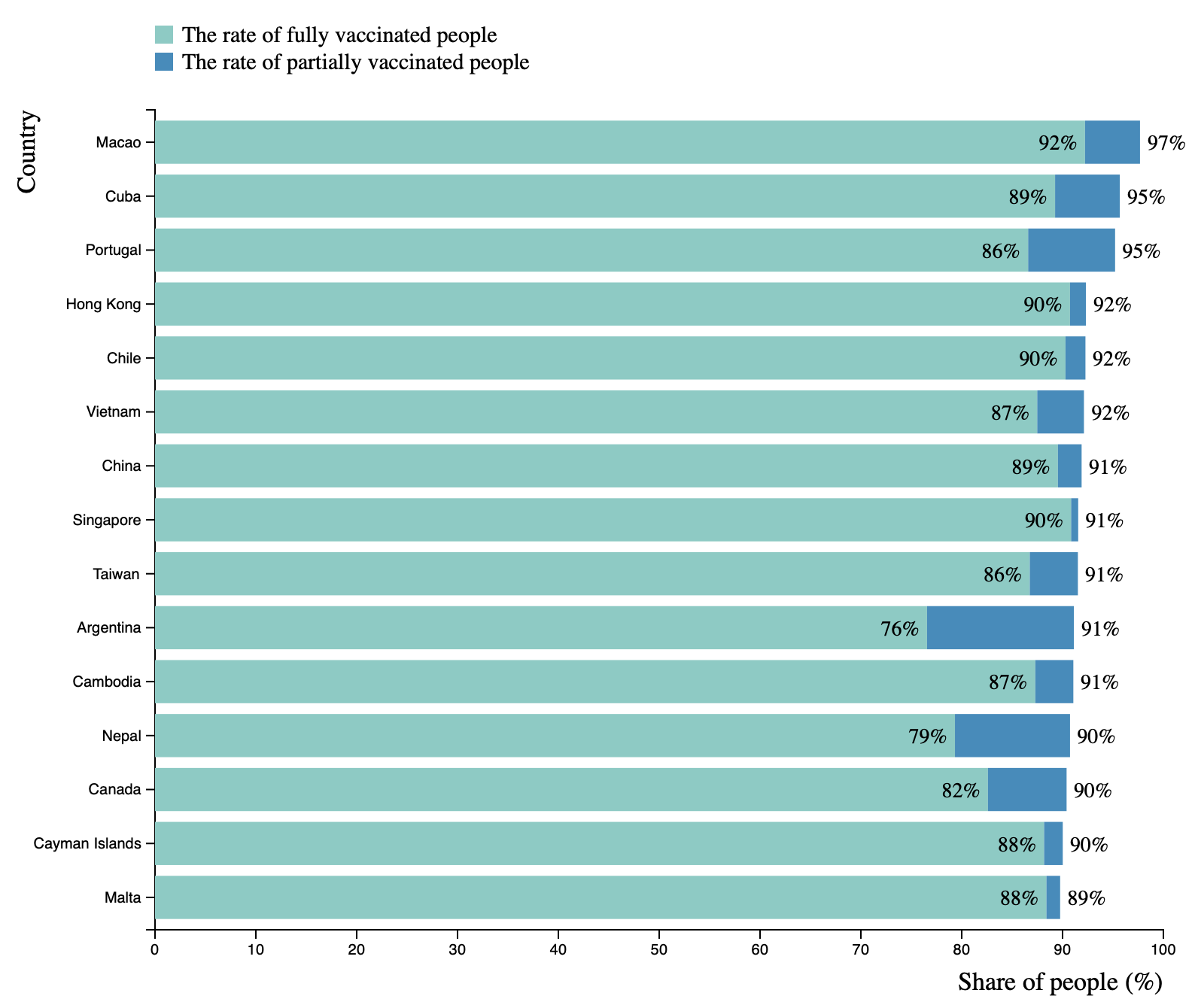
.attr('fill', 'black');해당 코드를 통해 나온 결과는 다음과 같다.
Result
전체 코드
d3.csv('data/owid-covid-data.csv')
	.then(data => {
        //people_vaccinated, people_fully_vaccinated, population
        const covid_data = data.map(d => {
            return {
                continent: d.continent,
                country: d.location,
                date: d.date,
                people_vaccinated: +d.people_vaccinated, // 총 접종자 수(부분 접종자 수 포함)
                people_fully_vaccinated: +d.people_fully_vaccinated, // 완벽 접종자 수
                population: +d.population // 전체 인구
            };
        }).filter(d => d.continent !== "");
        // continent가 공백이면 location 자리에 대륙명이 적혀있음 -> 나라별이니까 그런 값들은 제거

        console.log(covid_data);

        const latestDataByCountry = Array.from(
            d3.group(covid_data, d => d.country),
            ([country , data]) => {
              const maxVaccinated = d3.max(data, d => d.people_vaccinated);
              const latestData = data.find(d => d.people_vaccinated === maxVaccinated);
              return latestData;
            }
        ); // 최신이 필요하면 그냥 나라별 가장 접종자 수가 가장 많은 데이터를 찾으면 됨.

        console.log(latestDataByCountry);

        // Filter the data
        const mappedData = latestDataByCountry.map(d => {
            const totalVaccinated = d.people_vaccinated;
            const totalPopulation = d.population;
            const fullyVaccinated = d.people_fully_vaccinated;

            // 전체 인구수 대비 백분율 계산
            const vaccinatedPercentage = totalVaccinated / totalPopulation * 100;
            const fullyVaccinatedPercentage = fullyVaccinated / totalPopulation * 100;
            const partiallyVaccinatedPercentage = (totalVaccinated - fullyVaccinated) / totalPopulation * 100;

            return {
              country: d.country,
              vaccinatedPercentage: vaccinatedPercentage.toFixed(2),
              fullyVaccinatedPercentage: fullyVaccinatedPercentage.toFixed(2),
              partiallyVaccinatedPercentage: partiallyVaccinatedPercentage.toFixed(2)
              // 정수로 바꿨더니 오차가 너무 커서 소수점 둘째 자리로 고정
            };
        }).filter(d => d.vaccinatedPercentage < 100) // 인구 수 == 접종자 수인 경우 제거
            .sort((a, b) => b.vaccinatedPercentage - a.vaccinatedPercentage) // 백신 접종 비율 내림차순 정렬
            .slice(0, 15); // 상위 15개 국가로 slice

        // draw the stacked bar chart
        console.log(mappedData);
        drawBarChart(mappedData);

	})
 	.catch(error => {
         console.error(error);
	});

function drawBarChart(data){

    const margin = {top: 5, right: 30, bottom: 50, left: 100},
    width = 800 - margin.left - margin.right,
    height = 600 - margin.top - margin.bottom;

    // Define the position of the chart
    const svg = d3.select("#chart")
       .append("svg")
       .attr('width', width + margin.left + margin.right)
       .attr('height', height + margin.top + margin.bottom)
          .append("g")
          .attr("transform", `translate(${margin.left},${margin.top})`);

    // Create a scale for x-axis
    const xScale = d3.scaleLinear()
        .domain([0, 100])
        .range([0, width]);

    // Create a scale for y-axis
    const yScale = d3.scaleBand()
        .domain(data.map(d => d.country))
        .range([0, height])
        .padding(0.2);

    // Define the position of each axis
    const xAxis = d3.axisBottom(xScale);
    const yAxis = d3.axisLeft(yScale);

    // Draw axes
    svg.append("g")
        .attr('class', 'x-axis')
        .attr('transform', `translate(0, ${height})`)
        .call(xAxis);

    svg.append("g")
        .attr('class', 'y-axis')
        .call(yAxis)

    // Define a scale for color
    // const cScale
    // Define a scale for color
    const cScale = d3.scaleOrdinal()
        .domain(["fullyVaccinatedPercentage", "partiallyVaccinatedPercentage"])
        .range(['#7bccc4', '#2b8cbe']);

    const stackedData = d3.stack().keys(["fullyVaccinatedPercentage", "partiallyVaccinatedPercentage"])(
        data.map(d => {
          return {
            country: d.country,
            fullyVaccinatedPercentage: d.fullyVaccinatedPercentage,
            partiallyVaccinatedPercentage: d.partiallyVaccinatedPercentage
          }
        })
    );
    console.log(stackedData);

    // Draw the bars
    svg.selectAll('.bar')
        .data(stackedData)
        .enter()
        .append('g')
        .attr('class', 'bar')
        .attr('fill', d => cScale(d.key))
        .selectAll('rect')
        .data(d => d)
        .enter()
        .append('rect')
        .attr('x', d => xScale(d[0]))
        .attr('y', d => yScale(d.data.country))
        .attr('width', d => xScale(d[1]) - xScale(d[0]))
        .attr('height', yScale.bandwidth());

    svg.selectAll('.label')
        .data(data)
        .enter()
        .append('text')
        .text(d => `${parseInt(d.fullyVaccinatedPercentage)}%`)
        .attr('x', d => xScale(parseFloat(d.fullyVaccinatedPercentage)))
        .attr('y', d => yScale(d.country) + yScale.bandwidth() / 2)
        .attr('dx', -5)
        .attr('dy', '0.35em')
        .attr('font-size', 14)
        .attr('text-anchor', 'end')
        .attr('fill', 'black');

    svg.selectAll('.label-total')
        .data(data)
        .enter()
        .append('text')
        .text(d => `${parseInt(d.vaccinatedPercentage)}%`)
        .attr('x', d => xScale(parseFloat(d.vaccinatedPercentage)))
        .attr('y', d => yScale(d.country) + yScale.bandwidth() / 2)
        .attr('dx', 5)
        .attr('dy', '0.35em')
        .attr('font-size', 14)
        .attr('text-anchor', 'start')
        .attr('fill', 'black');

    // Indicate the x-axis label
    svg.append("text")
        .attr("text-anchor", "end")
        .attr("x", width)
        .attr("y", height + 40)
        .attr("font-size", 17)
        .text("Share of people (%)");

    svg.append("text")
        .attr("text-anchor", "end")
        .attr("x", 0)
        .attr("y", -80)
        .attr("transform", "rotate(-90)")
        .attr("font-size", 17)
        .text("Country");

    // Legend
    const legend = d3.select("#legend")
        .append("svg")
        .attr('width', width)
        .attr('height', 70)
            .append("g")
            .attr("transform", `translate(${margin.left},${margin.top})`);

    legend.append("rect").attr('x', 0).attr('y', 18).attr('width', 12).attr('height', 12).style("fill", "#7bccc4")
    legend.append("rect").attr('x', 0).attr('y', 36).attr('width', 12).attr('height', 12).style("fill", "#2b8cbe")
    legend.append("text").attr("x", 18).attr("y", 18).text("The rate of fully vaccinated people").style("font-size", "15px").attr('text-anchor', 'start').attr('alignment-baseline', 'hanging');
    legend.append("text").attr("x", 18).attr("y", 36).text("The rate of partially vaccinated people").style("font-size", "15px").attr('text-anchor', 'start').attr('alignment-baseline', 'hanging');

}'Dev > Web' 카테고리의 다른 글
| [Dev, Javascript] D3 예제 - 라인 차트(Line Chart) (0) | 2023.04.09 |
|---|---|
| [Dev, Javascript] D3를 사용해보자 - 2 (0) | 2023.04.07 |
| [Dev, Javascript] D3를 사용해보자 - 1 (0) | 2023.04.05 |